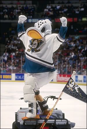
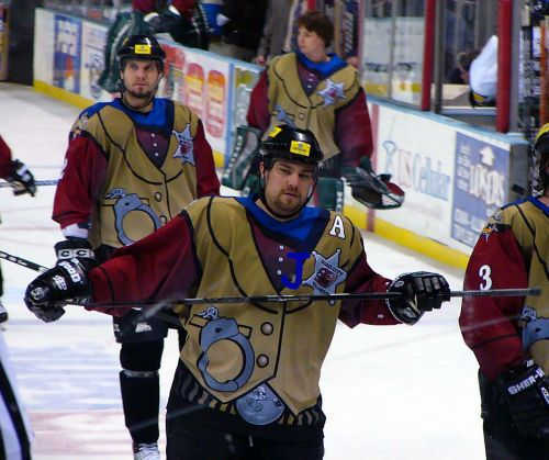
The 1995-96 Mighty Ducks of Anaheim alternate jersey was one of the original five alternate jerseys in the NHL. Doing away with the traditional main logo crest, the Mighty Ducks used the dye-sublimation process to create a unique design picturing not the team's logo, but an embarrassing cartoon of it's mascot, Wild Wing, bursting through the ice in a superhero pose.
The team only made matters worse with its choice for the name and numbers, the cartoonish, unattractive and difficult to read font, Mistral.

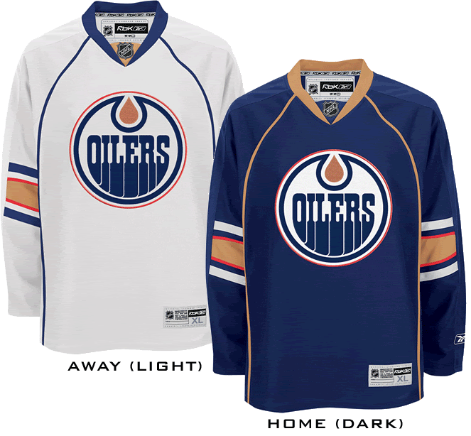
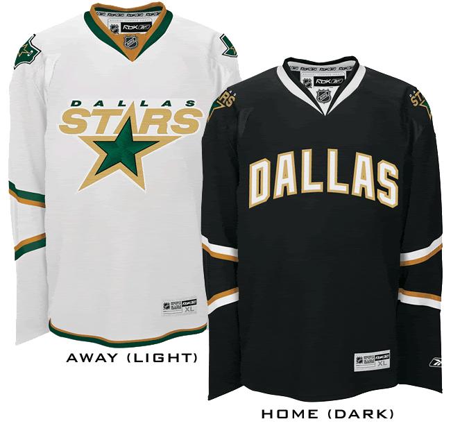
The jersey, dubbed "The Wild Wing Jersey" almost always ranks first or second in "worst jersey" lists due to it's embarrassing cartoon "logo" design, horrible font and trendy non-hockey color for the jerseys. The players hated being seen wearing them and, as a result, the jersey only had a life span of six games before being shelved for good. The game dates were 1/27/96 vs. Los Angeles (who wore their Burger King jerseys, making for the single most visually appalling game in league history), 2/2/96 vs. the Hartford Whalers, 3/3/96 vs. the Tampa Bay Lightning, 3/8/96 vs. the Buffalo Sabres, 4/3/96 vs. the Edmonton Oilers and one final time on 4/12/96 vs. the Dallas Stars, going 3-2-1 in those games.
We've even read an account that the players said theydid not want to wear them for a second season and additionally did not want any pictures of them wearing the jersey in the following year's Mighty Ducks media guide!
Little is known about who was involved in the development of the Wild Wing and what their thought process was. Apparently no one wants to take credit for being responsible for the worst jersey in NHL history, but you can safely bet that non-hockey people at Disney had a large part in such an unconventional approach to hockey sweater design.
As a result of it's short period of use, there were no additional patches worn on this jersey, not that you would be able to pick one out among all the visual noise of the design anyway.
This jersey must be classified as "Weird" and "Ugly". If it weren't for then owner Disney's involvement with the jersey, we'd include "curious", but with Disney involved, there's no curiosity as to where this monstrosity came from. We will also allow ourselves a bit of leeway in the case of this especially horrid jersey and also classify it as "Stupid".
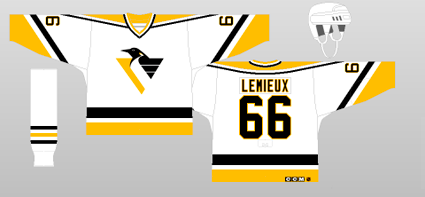
In all honesty, if you strip away the cartoon logo and font used, the jersey pattern of the pointed shoulder area, similar to the current Penguins home jerseys of the day, and sleeve striping is a good base from which to work from. But the accolades stop there.
The primary jade color of the jersey was just too trendy, too "California", to embrace. The font was thin and reedy and much too busy for it's own good. The secondary logos were hard enough to live with on the home and road jerseys for traditionalists, but the front of the jersey?
It's the stupidest thing we've ever seen on an NHL jersey, bar none.


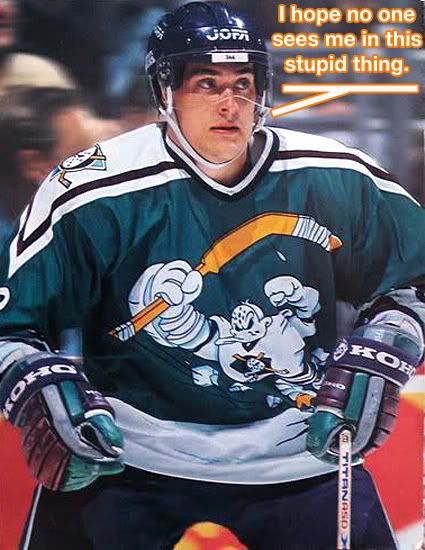
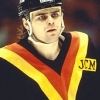
Here is the all-time greatest photo of the Wild Wing jersey, as Teemu Selanne imitates the design on the front of the jersey with his arms in the air and stick raised. The only thing missing is the hole in the ice below him!

Our video section begins with the Mighty Ducks of Anaheim debuting their new "Wild Wing" jerseys against the Los Angeles Kings, who were wearing their awful "Burger King" jerseys for the first time during same game.
Next, a goal by Paul Kariya while the Worst Dressed Game in NHL History™ continues.
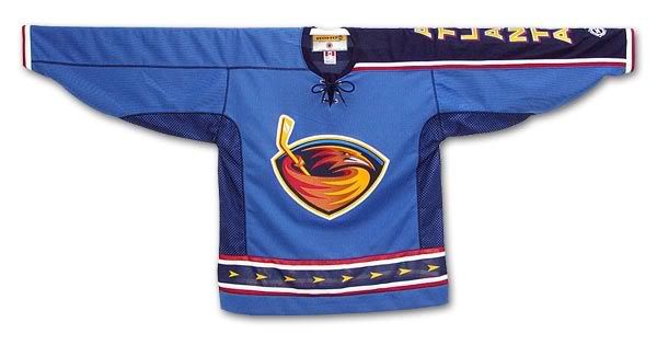
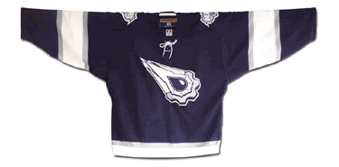
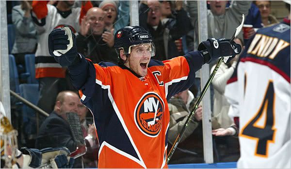
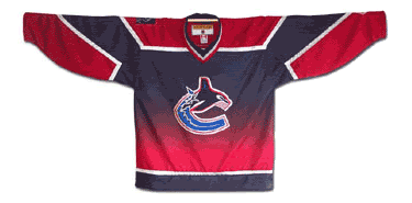
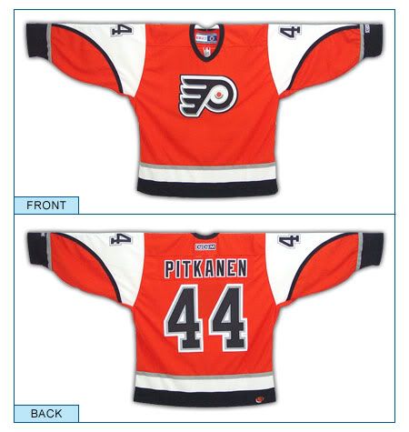
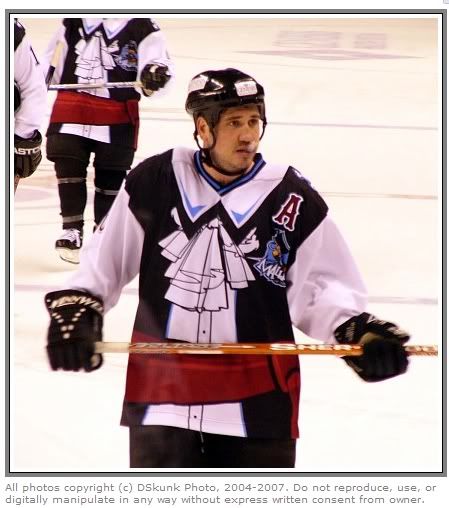
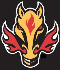
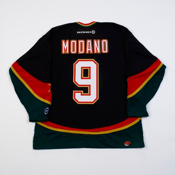
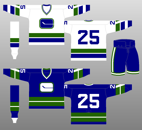
That wraps up our trip through the "Curious, Weird and Ugly" Collection for this year. There are other jerseys that certainly qualify, most specifically the Atlanta Thrashers alternates of 2003-04, or the Todd McFarlane designed Edmonton Oilers alternates of 2001-02, the New York Islanders road construction workers vests of 2002-03, the Vancouver Canucks color fading alternates of 2001-02 or the Philadelphia Flyers alternates of 2002-03 as well as nearly anything and everything from the Reebok Edge Uniform System™ (9% less wind drag, 14% lighter and 50% more expensive!). Many also mention the Calgary Flames "Flaming Horse Head" alternates of 1998-99, but we happen to think those are pretty cool and refuse to add them to the discussion.
The most recent entry in the collection, confirmed by any search on the internet for "ugly hockey jerseys", is the Montreal Canadiens 1912-13 throwbacks worn last year to celebrate the Canadiens 100th anniversary which were most often compared to prison uniforms. They were scheduled to wear them twice, but then coach Bob Gainey opted to skip their second scheduled appearance due to the reaction to them after the first time and go with the more traditional 1916 jerseys instead.
There could also be a book written about some of the "Hideous, Stupid and Embarrassing" jerseys that have been forced on unsuspecting minor league hockey players over the years, but the vast majority of those are one time only jerseys that are outlandish on purpose in order to generate some publicity for the clubs, unlike the strange and weird NHL jerseys I've chronicled that were meant to be taken seriously only to suffer the unanticipated backlash from both the fans and the media.
If you have any nominees for inclusion in the "Curious, Weird and Ugly" Collection, feel free to add your thoughts in the comments section below.


